
You use widgets to add content (such as stories, links and upcoming events) to your bulletin or web page. They are essential design features, and each one has a different function. In this article we'll take a closer look at Page Specific Custom Widgets. Page Specific Custom Widgets are custom widgets Page Specific Widgets are custom widgets only for the page they are being created for. They are not useable within other designers in ClubRunner. The widgets created under this tab can only be found within that specific content designer.
-
To access any widget, you need to be logged into your webpage. Then, access the relevant content editor, either for your website or bulletin.
-
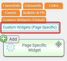
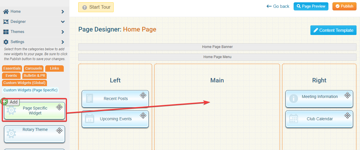
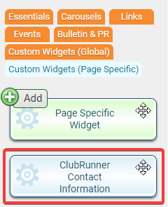
Once you have accessed your appropriate content editor, you can choose to select a new Global or Page Specific widget. in this instance we'll look at the creation of a Page Specific Custom widget. You can create these by clicking on the orange Custom Widgets (Page Specific) tab.
-
You should see the first Widget in the group, the Page Specific Widget. Left click and drag the widget to the desired frame.
-
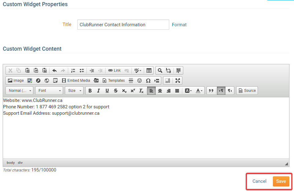
This now opens the Edit Custom Widget page. Here you can customize the widget to your liking. Use the Title field to give the widget a name, and then enter your desired information in the editing field under the Custom Widget Content heading. You may use the edit tools to format text and insert images, media and links.
Note: When giving the Custom Widget a title you should be aware that the Custom Widget will be added to the list of custom widgets based on the Title.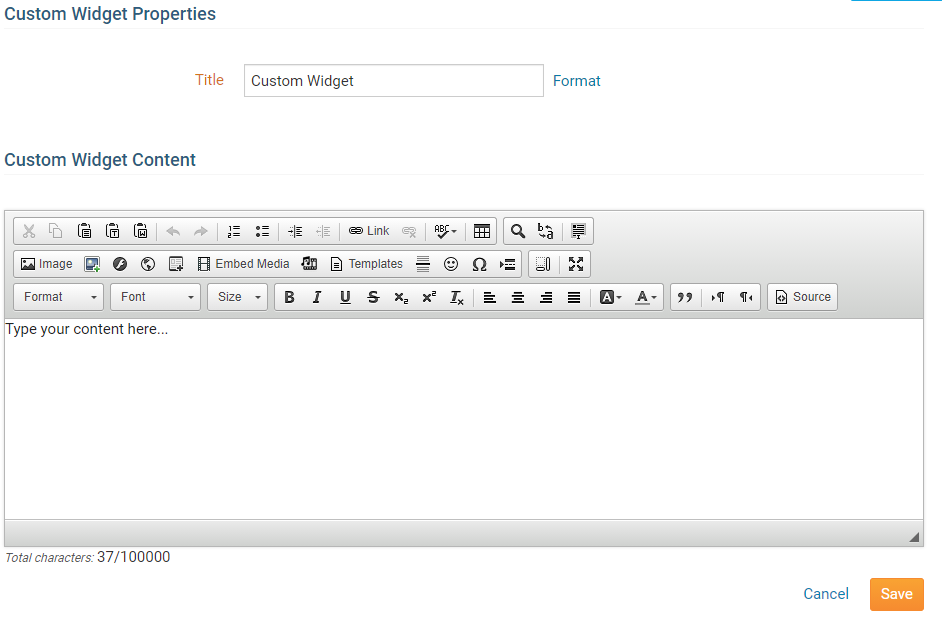
-
Once you have finished entering the content of your custom widget, you have two options.
- Save: This will save the new Custom Content and publish it to indicate that the widget is complete.
- Cancel: This will discard the changes you have made.
-
When you go back to the Home Page content designer and you click on the Custom Widgets (Page Specific) tab you will see your custom widget added to the list. That custom widget can now be used on the page.
Properties
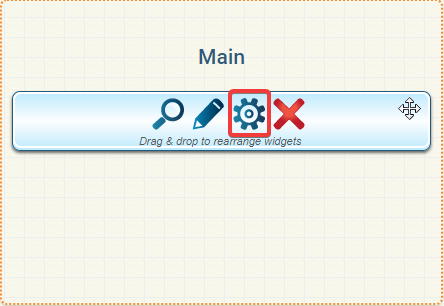
Each widget has a function that permits you to edit the widget properties.
-
To access the widget properties, hover your mouse over the widget once it is in place. Click on the Gear icon when it appears.
-
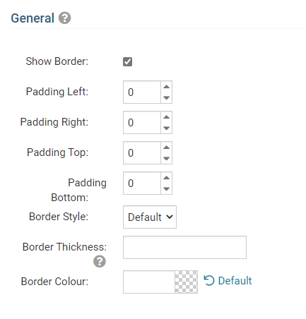
You may now edit categories under the various headings. Under the General category you can edit spacing and border properties for the widget's border.
- Show Border: Click this check box if you wish to display a border around the widget.
- Padding Left: Enter a value in pixels to set a space to the left of the widget.
- Padding Right: Enter a value in pixels to set a space to the right of the widget.
- Padding Top: Enter a value in pixels to set a space above the widget.
- Padding Bottom: Enter a value in pixels to set a space below the widget.
- Border Style: Use this drop-down menu to choose a border style.
- Border Thickness: Enter a number to change the border setting. Leave blank to set the default.
- Border Colour: Click on the colour choice window to set a border colour.
-
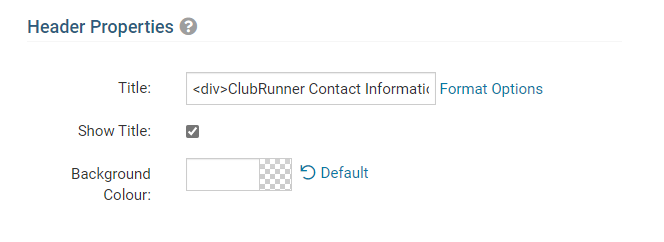
In the section marked Header Properties you may customize the appearance of the widget title.
- Title: Use this field to enter a new title for the header. This will not change the title of the widget, but rather the heading under which the widget is displayed. You may edit the style and appearance of the text with the format options link to the right of the title field.
- Show Title: Uncheck this box if you do not wish to display the title.
- Font: Use this drop-down menu to select the font you wish to use.
- Colour: Use this colour selection window to set the colour of the font.
- Background Colour: Use this colour selection window to set the background colour of the font.
-
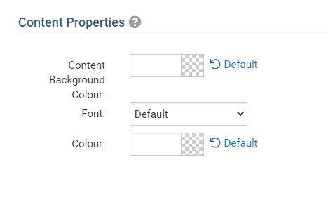
Under the Content Properties heading, you may adjust the appearance of the content and select which information to display.
- Content Background Colour: Set the background colour of your content.
- Font: Use this drop down to select the font you wish to use for your your content text.
- Colour: Use this colour selection window to set the colour of the brief text.
-
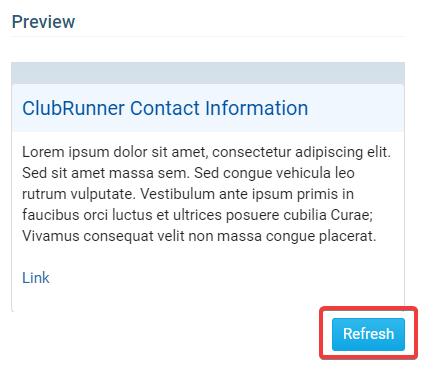
If you wish to get a sneak peek of your formatting changes, refer to the Preview window on the right side of the screen. To see updates, click the Refresh button.
Note: The Preview button displays placeholder content that reflects your style changes, and not the actual content of your widget.