
You use widgets to add content, such as stories, links and upcoming events, to your bulletin or web page. They are essential design features, and each one has a different function. In this article we'll take a closer look at the Download Files widget, which is specific to the Web Designer tool. This widget is used to add a link to various files and documents your organization members can access through your website.
1. To access any widget, you need to be logged into your webpage. Then, access your webpage editor.
2. Once you have opened the content you wish to edit, you can access the Download Files widget on the left side of the screen. It is under the Essentials widget tab.
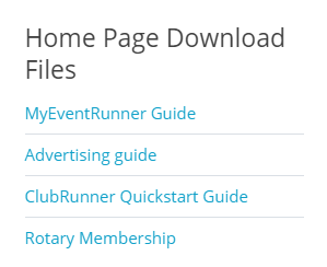
3. Once in place, the widget displays download links to any files you have associated with it. Visitors to your webpage can click on these links to download the files.
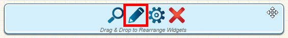
4. To edit the files associated with the widget, open the content editor where the widget has been placed. Hover your mouse on top of the widget. Then, click on the Pencil icon to edit the download files accessible through this widget.
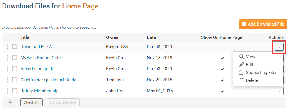
5. On the Download Files editor screen, click the Add Down File button to add a file to the widget.
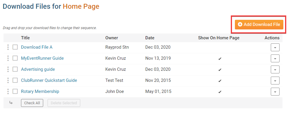
6. To edit existing content, make use of the links beneath the Actions column on the right side of the screen.
- View: Click here to preview the content by downloading it.
- Edit: Use this link to choose a different file, or change the title of the download link.
- Supporting Files: If you upload an HTML file with embedded images, this allows you to upload those embedded images so that all the references work. This feature can be useful for users better versed in HTML coding, and is normally not needed.
- Delete: Remove the uploaded file and link from the widget.
Editing Widget Properties
Each widget has a function that permits you to edit the widget properties. Most widgets have standard properties, but some have special rules.
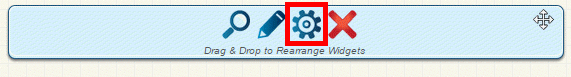
1. To access the widget properties, hover your mouse over the widget once it is in place. Click on the Gear icon when it appears.
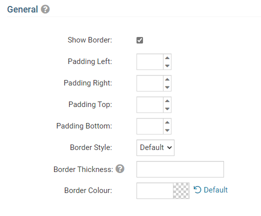
2. You may now edit categories under the various headings. Under the General category you can edit spacing and border properties for the widget's border.
- Show Border: Click this check box if you wish to display a border around the widget.
- Padding Left: Enter a value in pixels to set a space to the left of the widget.
- Padding Right: Enter a value in pixels to set a space to the right of the widget.
- Padding Top: Enter a value in pixels to set a space above the widget.
- Padding Bottom: Enter a value in pixels to set a space below the widget.
- Border Style: Use this drop-down menu to choose a border style.
- Border Thickness: Enter a number to change the border setting. Leave blank to set the default.
- Border Colour: Click on the colour choice window to set a border colour.
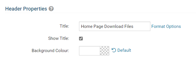
3. In the section marked Header Properties you may customize the appearance of the widget title.
- Title: Use this field to enter a new title for the header. This will not change the title of the widget, but rather the heading under which the widget is displayed. You may edit the style and appearance of the text with the format options link to the right of the title field.
- Show Title: Uncheck this box if you do not wish to display the title.
- Background Colour: Use this colour selection window to set the background colour of the font.
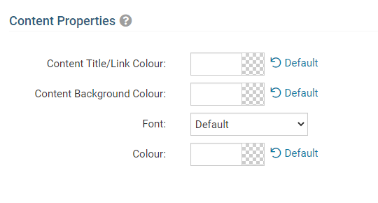
4. Under the Content Properties heading, you may adjust the appearance of the content and select which information to display.
- Content Title/Link Colour: Use this colour selection window to set the colour of your content title, as well as any links within it.
- Content Background Colour: Set the background colour of your content.
- Font: Use this drop down to select the font you wish to use for your your content text.
- Colour: Use this colour selection window to set the colour of the brief text.
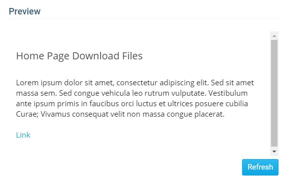
5. If you wish to get a sneak peek of your formatting changes, refer to the Preview window on the right side of the screen. To see updates, click the Refresh button.