
You use widgets to add content, such as stories and upcoming events to your bulletin or web page. They are essential design features, and each one has a different function. In this article we'll take a closer look at the Executives and Directors widget.
1. To access any widget, you need to be logged into your webpage. Then, access your bulletin or webpage editor.
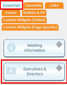
2. Once you have opened the content you wish to edit, you can access the Executives and Directors widget on the left side of the screen. It is under the Essentials widget tab.
3. When placed into your content, the Executives and Directors widget displays a list of any of your identified group executives, directors, and officers.

Editing Widget Information
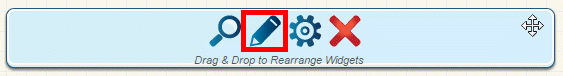
1. You can change the information displayed in this widget by editing it. When the widget is placed within the content, hover your mouse over it. Then click on the Pencil icon when it appears.
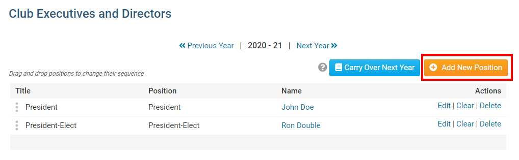
2. This brings you to the Club Executives and Directors page. Here, you can see a list of current club positions and the name of the members assigned to those positions. Use the links under the Action heading to manage your club executives.
- Edit: Click this to select a new member for the position, or to alter the position assigned to the member.
- Clear: Click here to remove a member from the position, while retaining the position. You may then assign another member using the edit function.
- Delete: Click this if you wish to remove the position entirely.
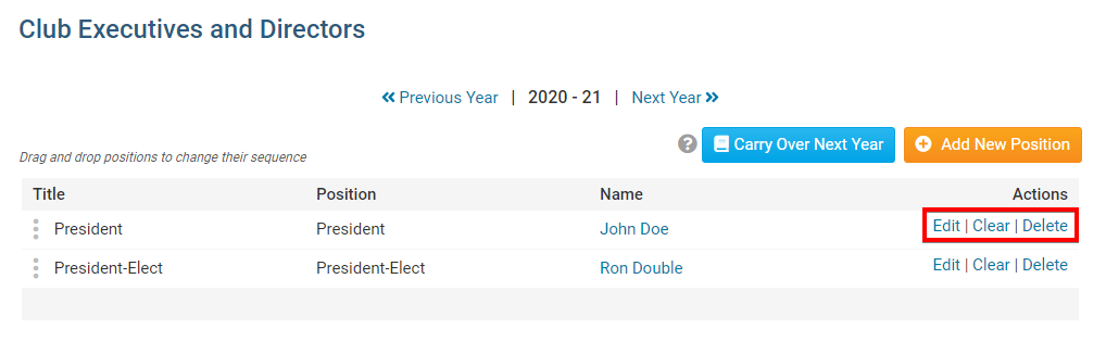
3. If you wish to add a new club executive position, click on the orange Add New Position button.
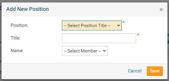
4. You will be prompted to select the position and member name from a drop-down list. Click Save when you are complete.
Editing Widget Properties
Each widget has a function that permits you to edit the widget properties. Most widgets have standard properties, but some have special rules.
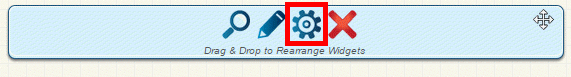
1. To access the widget properties, hover your mouse over the widget once it is in place. Click on the Gear icon when it appears.
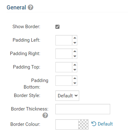
2. You may now edit categories under the various headings. Under the General category you can edit spacing and border properies for the widget's border.
- Show Border: Click this check box if you wish to display a border around the widget.
- Padding Left: Enter a value in pixels to set a space to the left of the widget.
- Padding Right: Enter a value in pixels to set a space to the right of the widget.
- Padding Top: Enter a value in pixels to set a space above the widget.
- Padding Bottom: Enter a value in pixels to set a space below the widget.
- Border Style: Use this drop-down menu to choose a border style.
- Border Thickness: Enter a number to change the border setting. Leave blank to set the default.
- Border Colour: Click on the colour choice window to set a border colour.
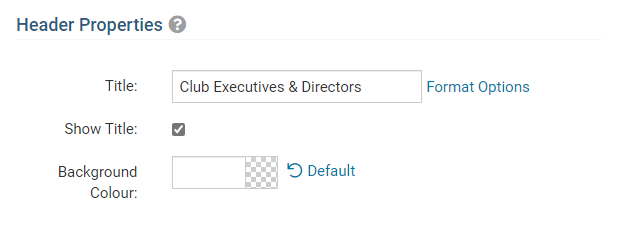
3. In the section marked Header Properties you may customize the appearance of the widget title.
Title: Use this field to enter a new title for the header. This will not change the title of the widget, but rather the heading under which the widget is displayed. You may edit the style and appearance of the text with the format options link to the right of the title field.
- Show Title: Uncheck this box if you do not wish to display the title.
- Font: Use this drop-down menu to select the font you wish to use.
- Colour: Use this colour selection window to set the colour of the font.
- Background Colour: Use this colour selection window to set the background colour of the font.
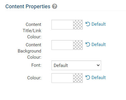
4. Under the Content Properties heading, you may adjust the appearance of the content and select which information to display.
- Content Title/Link Colour: Use this colour selection window to set the colour of the widget title as well as the colour of links within the widget.
- Content Background Colour: Use this colour selection to set the background colour of the widget.
- Font: Use this drop-down menu to select the font you wish to use.
- Colour: Use this colour selection window to set the colour of the font.