
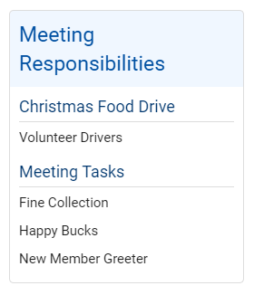
You use widgets to add content (such as stories, links and upcoming events) to your bulletin or web page. They are essential design features, and each one has a different function. In this article we'll take a closer look at the Meeting Responsibilities widget. This widget displays a list of responsibilities assigned for an upcoming meeting.
1. To access any widget, you need to be logged into your webpage. Then, access your webpage editor.
2. Once you have opened the content you wish to edit, you can access the Meeting Responsibilities widget on the left side of the screen. It is under the Events widget tab.
3. One in place and published, the widget displays a list of meeting tasks for any upcoming meetings.
4. If you wish to change the tasks displayed in the Meeting Responsibilities widget, hover your mouse over the widget once it has been placed in a content area. Click on the Box with an arrow icon to edit the widget.
5. This brings you to the Meeting Responsibilities page, where you can view a complete list of responsibilities created for various meetings and events. To create a new position, click Add New Position.
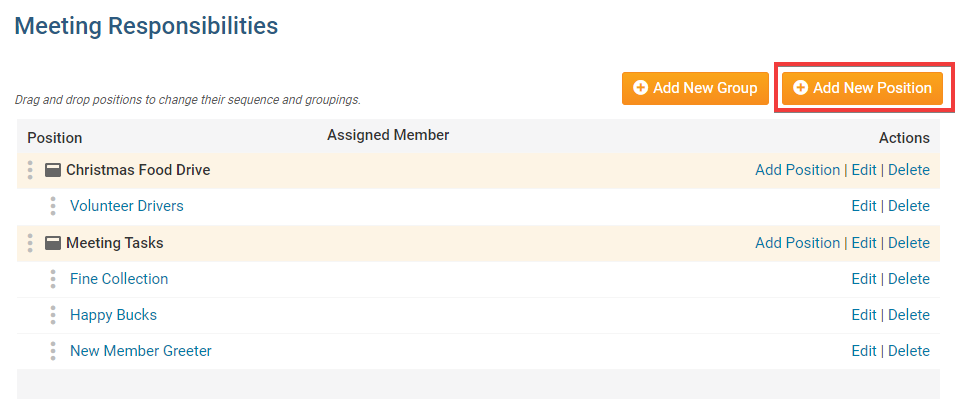
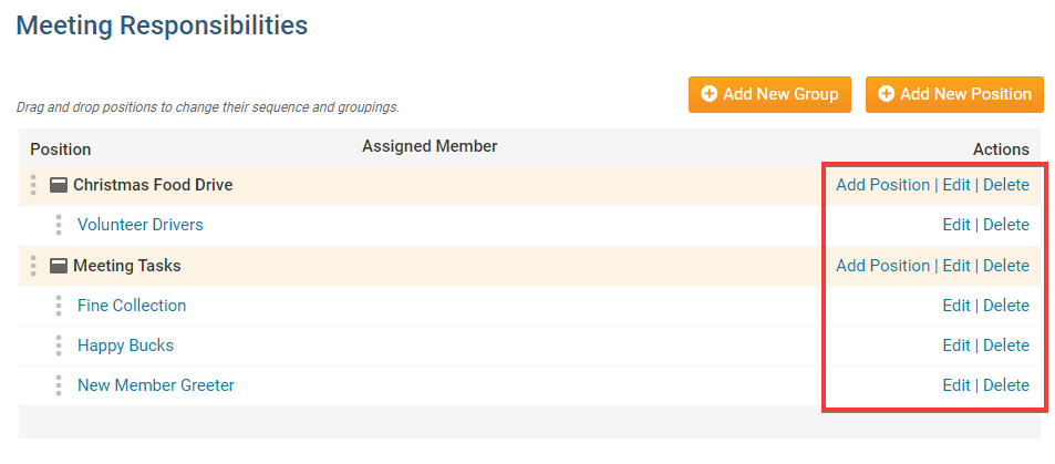
6. To view or change an existing meeting task, used the options under the Actions header.
Add Position: Click this to add a new position to a task group.
Edit: Click to change the details of a given position or task group.
Delete: Remove a given task group or position.
Editing Widget Properties
Each widget has a function that permits you to edit the widget properties. Most widgets have standard properties, but some have special rules.
1. To access the widget properties, hover your mouse over the widget once it is in place. Click on the Gear icon when it appears.
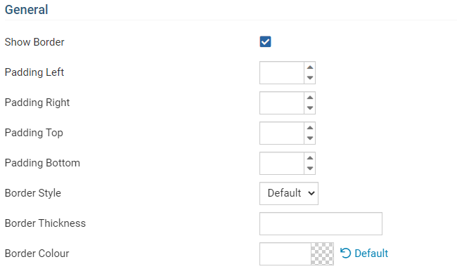
2. You may now edit categories under the various headings. Under the General category you can edit spacing and border properties for the widget's border.
Show Border: Click this check box if you wish to display a border around the widget.
Padding Left: Enter a value in pixels to set a space to the left of the widget.
Padding Right: Enter a value in pixels to set a space to the right of the widget.
Padding Top: Enter a value in pixels to set a space above the widget.
Padding Bottom: Enter a value in pixels to set a space below the widget.
Border Style: Use this drop-down menu to choose a border style.
Border Thickness: Enter a number to change the border setting. Leave blank to set the default.
Border Colour: Click on the colour choice window to set a border colour.
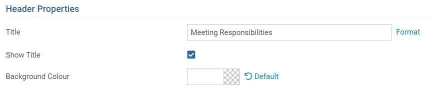
3. In the section marked Header Properties you may customize the appearance of the widget title.
Title: Use this field to enter a new title for the header. This will not change the title of the widget, but rather the heading under which the widget is displayed. You may edit the style and appearance of the text with the format options link to the right of the title field.
Show Title: Uncheck this box if you do not wish to display the title.
Background Colour: Use this colour selection box to set the background of the font.
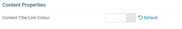
4. In the Content Properties section, you may define the colour of the Speaker link text and any other links.
Content Title/Link Colour: Use this colour selection menu to define the colour of the Speaker link text.
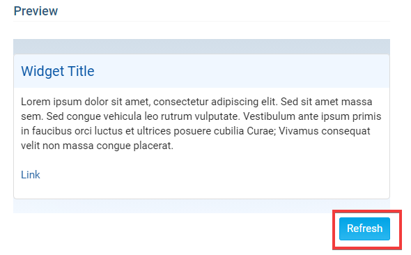
5. If you wish to get a sneak peek of your formatting changes, refer to the Preview window on the right side of the screen. To see updates, click the Refresh button.