
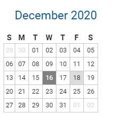
You use widgets to add content (such as stories, links and upcoming events) to your bulletin or web page. They are essential design features, and each one has a different function. In this article we'll take a closer look at the Mini Calendar widget. This widget displays a small calendar graphic, one which notes the current date and provides a link to events upcoming in the given month.
1. To access any widget, you need to be logged into your webpage. Then, access your webpage editor.
2. Once you have opened the content you wish to edit, you can access the Mini Calendar widget on the left side of the screen. It is under the Events widget tab.
3. Once in place and published, the widget displays a one month calendar. The current date in marked in dark grey. If an event is scheduled within the span of the displayed month, a link to event information is available through the date text on that calendar square.
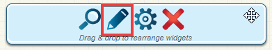
4. If you wish to change the events displayed in the Mini Calendar widget, hover your mouse over the widget once it has been placed in a content area. Click on the Pencil icon to edit the widget.
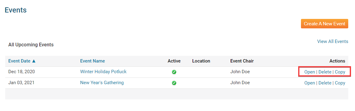
5. On the Events editing page, you can view and edit existing events, and create new ones. Click Create A New Event to add an event to the calendar.
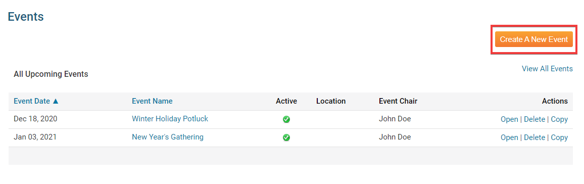
6. To view or change an existing event, used the options under the Actions header.
- Open: Click Open to view the event specifics and edit them if needed.
- Delete: Click Delete to remove the event. Remember, this will completely delete the event and all registration details, not simply remove it from the calendar.
- Copy: This allows you to create a copy of the event in the calendar.
Editing Widget Properties
Each widget has a function that permits you to edit the widget properties. Most widgets have standard properties, but some have special rules.
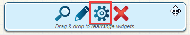
1. To access the widget properties, hover your mouse over the widget once it is in place. Click on the Gear icon when it appears.
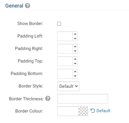
2. You may now edit categories under the various headings. Under the General category you can edit spacing and border properties for the widget's border.
- Show Border: Click this check box if you wish to display a border around the widget.
- Padding Left: Enter a value in pixels to set a space to the left of the widget.
- Padding Right: Enter a value in pixels to set a space to the right of the widget.
- Padding Top: Enter a value in pixels to set a space above the widget.
- Padding Bottom: Enter a value in pixels to set a space below the widget.
- Border Style: Use this drop-down menu to choose a border style.
- Border Thickness: Enter a number to change the border setting. Leave blank to set the default.
- Border Colour: Click on the colour choice window to set a border colour.
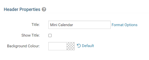
3. In the section marked Header Properties you may customize the appearance of the widget title.
- Title: Use this field to enter a new title for the header. This will not change the title of the widget, but rather the heading under which the widget is displayed. You may edit the style and appearance of the text with the format options link to the right of the title field.
- Show Title: Uncheck this box if you do not wish to display the title.