
You use widgets to add content, such as stories, links and upcoming events, to your bulletin or web page. They are essential design features, and each one has a different function. In this article we'll take a closer look at the Photo Albums widget. This widget is used to add a link to photo albums, which can be accessed by site visitors.
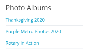
The Photo Albums widget will have your Photo Albums listed on your webpage. It looks like this:
1. To access any widget, you need to be logged into your webpage. Then, access your website editor. By clicking on Website on the grey menu bar near the top and then Website Designer.
2. This takes you to the Website designer page. Click on Edit Content to edit the body of your homepage.
3. To access the Photo Albums widget click on the Essentials widget tab on the left hand side of the screen.
4. Click and hold on Home Page Photo Albums widget and drag it to the location where you would like it to be located on your homepage and then let go of the mouse button.
5. To assign photo albums to the Photo Albums widget, hover your mouse over the widget. Click on either of the Edit icons.
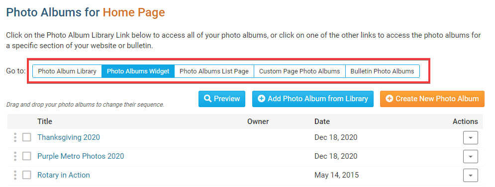
6. The Photo Albums widget editor allows you to create new photo albums, edit existing ones, remove and add photo albums to the widget. To make a new album, click Create New Photo Album and follow the steps in this article.
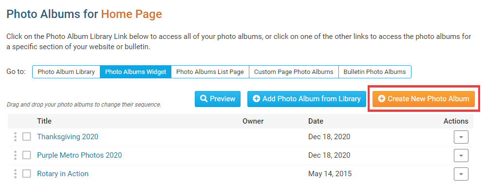
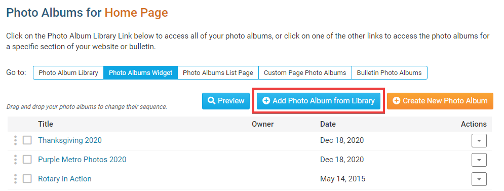
7. To add a photo album from one of your existing libraries, click Add Photo Album from Library. Then put a checkmark in the box beside the album(s) you want to display in the widget and click Add Selected Photo Albums.
8. To browse your existing albums, click on the tabs along the top of the widget.
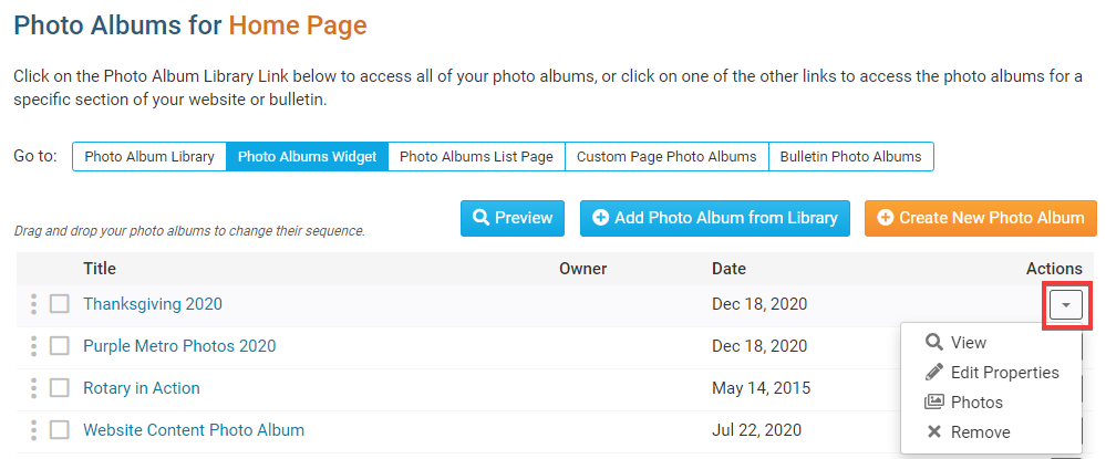
9. Once a photo album has been assigned to the widget, you can edit that album with the links under the Actions column.
- Photos: Clicking this link takes you to a page where you can add or remove photos from the album.
- Edit Properties: This allows you to change the title, description and owner of the album, as well as adjust other properties.
- Remove: This removes the album from the widget.
10. Once done you can click the Go Back button near the top right.
Editing Widget Properties
Each widget has a function that permits you to edit the widget properties. Most widgets have standard properties, but some have special rules.
1. To access the widget properties, hover your mouse over the widget once it is in place. Click on the Gear/Cog icon when it appears.
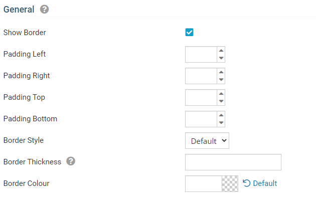
2. You may now edit categories under the various headings. Under the General category you can edit the spacing and border properties for the widget's border.
- Show Border: Click this check box if you wish to display a border around the widget.
- Padding Left: Enter a value in pixels to set a space to the left of the widget.
- Padding Right: Enter a value in pixels to set a space to the right of the widget.
- Padding Top: Enter a value in pixels to set a space above the widget.
- Padding Bottom: Enter a value in pixels to set a space below the widget.
- Border Style: Use this drop-down menu to choose a border style.
- Border Thickness: Enter a number to change the border setting. Leave blank to set the default.
- Border Colour: Click on the colour choice window to set a border colour.
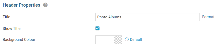
3. In the section marked Header Properties you may customize the appearance of the widget title.
- Title: Use this field to enter a new title for the header. This will not change the title of the widget, but rather the heading under which the widget is displayed. You may edit the style and appearance of the text with the format options link to the right of the title field.
- Show Title: Uncheck this box if you do not wish to display the title of the widget on the webpage.
- Font: Use this drop-down menu to select the font you wish to use.
- Colour: Use this colour selection window to set the colour of the font.
- Background Colour: Use this colour selection window to set the background colour of the font.
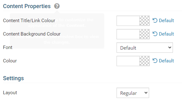
4. Under the Content Properties heading, you may adjust the appearance of the content and select which information to display.
- Content Title/Link Colour: Use this colour selection window to set the colour of your content title, as well as any links within it.
- Content Background Colour: Set the background colour of your content.
- Font: Use this drop down to select the font you wish to use for your your content text.
- Colour: Use this colour selection window to set the colour of the brief text.
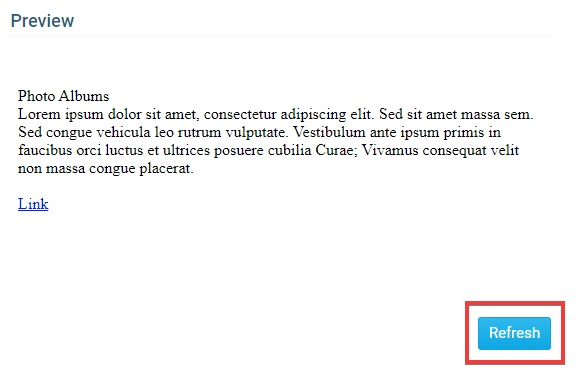
5. If you wish to get a sneak peek of your formatting changes, refer to the Preview window on the right side of the screen. To see updates, click the Refresh button.