
You use widgets to add content, such as stories and upcoming events to your bulletin or web page. They are essential design features, and each one has a different function. In this article we'll take a closer look at the Stories widget, which is specific to the Web Designer tool.
To access any widget, you need to be logged into your webpage. Then, click on Website on the grey menu bar near the top.
Then click Website Designer on the blue menu bar.
Once you have opened the content you wish to edit, you can access the Stories widget on the left side of the screen. It is under the Essentials widget tab.
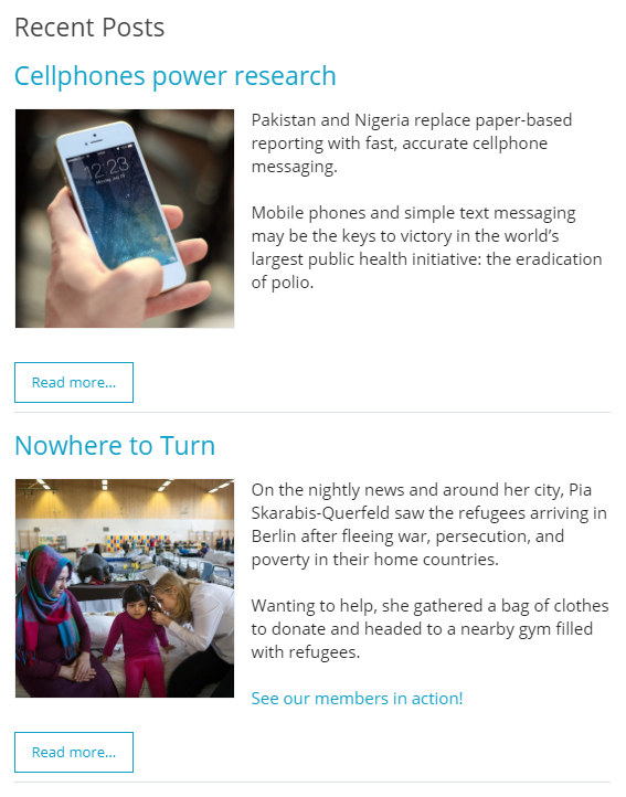
When placed into your content, the Stories widget displays any stories or articles you may have associated with it.
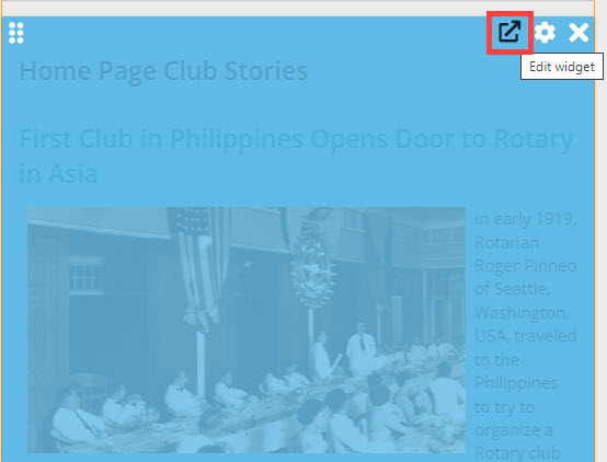
To choose the stories associated with the widget, you must edit it. Do this by hovering your mouse over the widget. Then, click on the outward arrow icon.
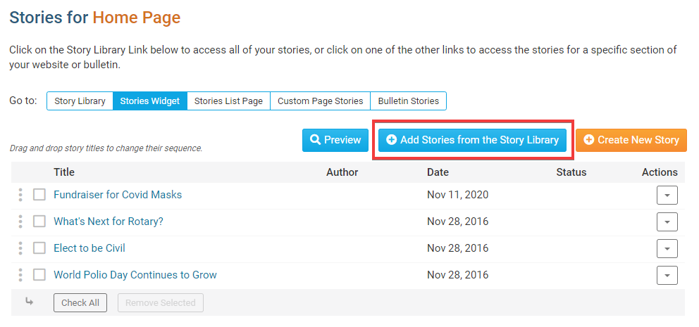
You are now on the Stories interface. Here, you may view all your created stories and select them for addition to the widget content. You may also create new story content and edit or remove existing content. To add an existing story, click Add Stories from the Story Library.
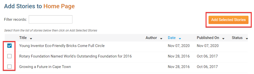
This will bring to a page listing all your available stories. Click on the checkbox next to the title of each story you wish to add, and then click the Add Selected Stories button.
Alternately, you may click on the Create New Story button and create an original new piece for the widget. This brings you to the Add a New Story page, where you may enter your story details, or copy information from an existing story.
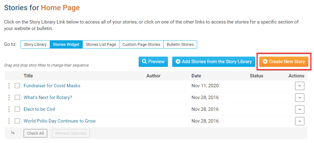
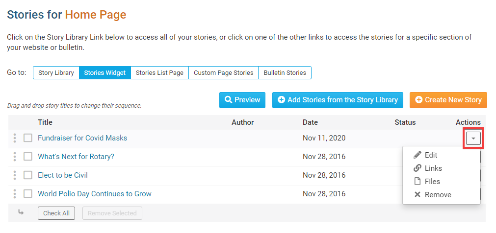
Finally, you may edit the stories assigned to the widget with the links under the Actions heading.
Edit: Click here to edit the content of the story.
Links: This allows you to add a related link to the story page. This link will appear under the heading Page Links on the full version of the story.
Files: Use this link to add download files to the story. This permits users viewing the story's page to download associated files.
Remove: Click this link to remove the story from the widget. Remember, this does not delete the story. It simply removes the content.
If you would like to change the order of the story, click, drag and drop the Grab Points, the three vertical dots, to the left of the story, to re-order the list.
Editing Widget Properties
Each widget has a function that permits you to edit the widget properties. Most widgets have standard properties, but some have special rules.
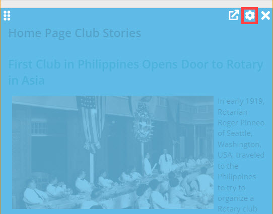
To access the widget properties, hover your mouse over the widget once it is in place. Click on the Gear icon when it appears.
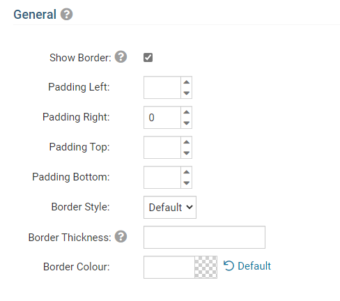
You may now edit categories under the various headings. Under the General category you can edit spacing and border properties for the widget's border.
Show Border: Click this check box if you wish to display a border around the widget.
Padding Left: Enter a value in pixels to set a space to the left of the widget.
Padding Right: Enter a value in pixels to set a space to the right of the widget.
Padding Top: Enter a value in pixels to set a space above the widget.
Padding Bottom: Enter a value in pixels to set a space below the widget.
Border Style: Use this drop-down menu to choose a border style.
Border Thickness: Enter a number to change the border setting. Leave blank to set the default.
Border Colour: Click on the colour choice window to set a border colour.
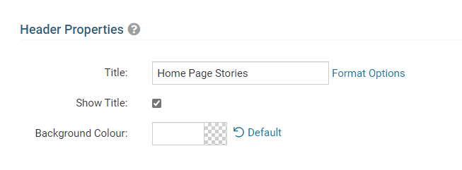
In the section marked Header Properties you may customize the appearance of the widget title.
Title: Use this field to enter a new title for the header. This will not change the title of the widget, but rather the heading under which the widget is displayed. You may edit the style and appearance of the text with the format options link to the right of the title field.
Show Title: Uncheck this box if you do not wish to display the title.
Font: Use this drop-down menu to select the font you wish to use.
Colour: Use this colour selection window to set the colour of the font.
Background Colour: Use this colour selection window to set the background colour of the font.
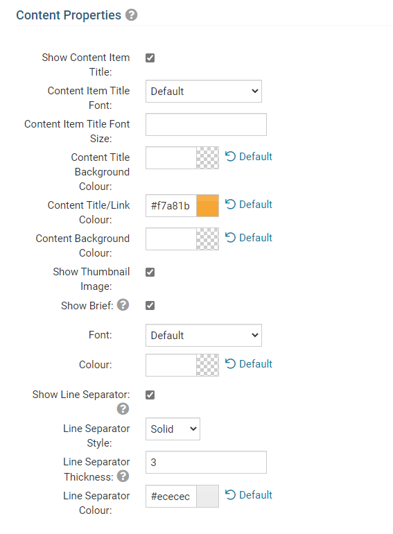
Under the Content Properties heading, you may adjust the appearance of the content and select which information to display.
Show Content Item Title: Click this if you wish to display the title of a given item within the Story widget.
Content Item Title Font: If you wish to display Item Titles, you may define their font with this field.
Content Item Title Font Size: Use this to set the font size of your displayed Item Titles.
Content Title Background Colour: Use this colour selection to set the background colour of your content Item Titles.
Content Title/Link Colour: Use this colour selection window to set the colour of your content title, as well as any links within it.
Content Background Colour: Set the background colour of your content.
Show Thumbnail Image: Display a small preview picture for content in the form of images.
Show Brief: This displays the brief, a summary of the story.
Font: Use this drop down to select the font you wish to use for your your content text.
Colour: Use this colour selection window to set the colour of the brief text.
Show Link Separator: Click this option to display a line between story item.
Line Separator Style: Use this drop down menu to select the style of the separation lines.
Line Separator Thickness: Enter a number here to set the thickness of the separation lines.
Line Separator Colour: Use this colour selection window to set the colour of the separation lines.
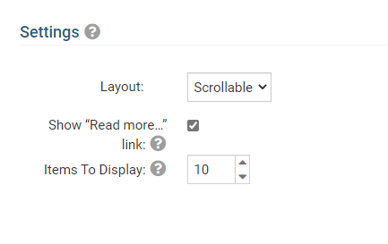
The Settings category controls additional functions of the widget.
Layout: "Regular" will list the stories as they have been before. "Columns" will cause your stories to stack in like a photo album type view. “Scrollable” will display the stories in a horizontal carousel.
Show "Read More" Link: Select this if you wish to display a "Read More" link beneath each story, which will open in a new window.
Items to Display: Use this to set the number of story items to display.
Click the orange Save button in the Widget Properties popup to save the changes to the widget, and see the changes in the Live Designer.