
You use widgets to add content (such as stories, links and upcoming events) to your bulletin or web page. They are essential design features, and each one has a different function. In this article we'll take a closer look at the District Info widget. The District Info widget is used by Rotary Districts to place links to more information about their district, such as their organization and a map of all the clubs in the district.
-
To access any widget, you need to be logged into your webpage. Then, access the relevant content editor, either for your website or bulletin.

-
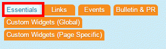
Once you have opened the content you wish to edit, you can access the District Info widget on the left side of the screen. It is located under the Bulletin & PR widget tab.
-
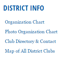
One in place and published, the District Info widget displays links to district information.
-
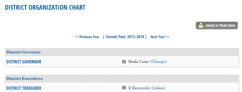
The Organization Chart opens up a list of District Executives and Officers, alone with email links embedded in their names. When you scroll over the highlighted icon, it opens a small information window containing Member Info Card, containing a basic view of their profile and contact information.
-
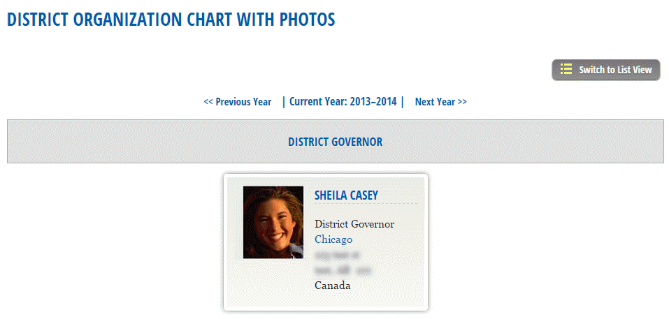
The Photo Organization Chart link opens a directory complete with photos of the governor and executives, if they have uploaded one.
-
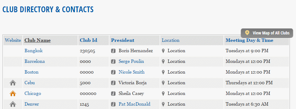
The Club Directory and Contact link opens a list of clubs within the district, as well meeting times and locations and a link to the president's profile.
-
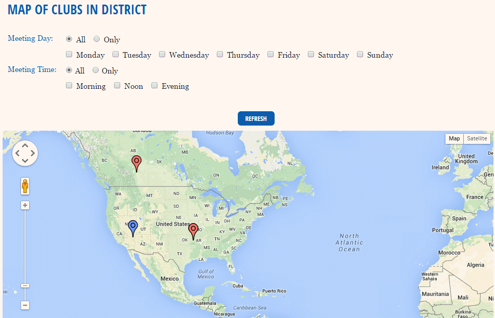
When you click on the Map of Clubs in District link, you are brought to a page displaying a Google map of the club meeting venues within this district. You may use the checkboxes and buttons above this map to filter the club meetings and times you wish to display.
Editing Widget Properties
Each widget has a function that permits you to edit the widget properties. Most widgets have standard properties, but some have special rules.
-
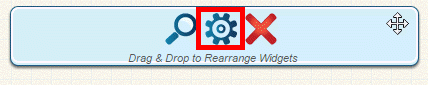
To access the widget properties, hover your mouse over the widget once it is in place. Click on the Gear icon when it appears.
-
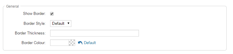
You may now edit categories under the various headings. Under the General category you can edit spacing and border properies for the widget's border.
- Show Border: Click this check box if you wish to display a border around the widget.
- Border Style: Use this drop-down menu to choose a border style.
- Border Thickness: Enter a number to change the border setting. Leave blank to set the default.
- Border Colour: Click on the colour choice window to set a border colour.
-
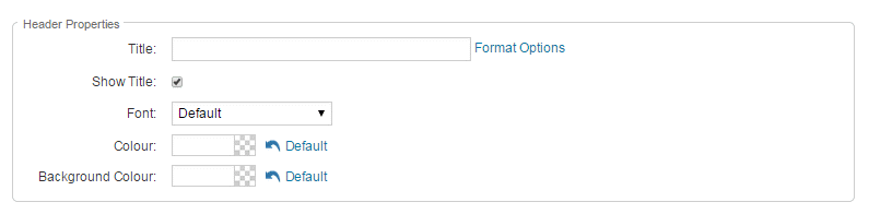
In the section marked Header Properties you may customize the appearance of the widget title.
- Title: Use this field to enter a new title for the header. This will not change the title of the widget, but rather the heading under which the widget is displayed. You may edit the style and appearance of the text with the format options link to the right of the title field.
- Show Title: Uncheck this box if you do not wish to display the title.
- Font: Select the font type for the title.
- Colour: Select the colour of the title font.
- Background Colour: Use this colour selection box to set the background of the font.
-
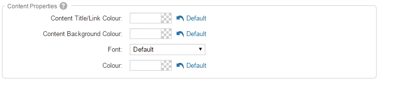
In the Content Properties section, you may define the colour of the Speaker link text and any other links.
- Content Title/Link Colour: Use this colour selection menu to define the colour of the Speaker link text.
- Content Background Colour: Use this colour selection box to set the background colour.
- Font: Choose a font to use for content text.
- Colour: Select the colour of the content font.
-
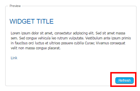
If you wish to get a sneak peek of your formatting changes, refer to the Preview window on the right side of the screen. To see updates, click the Refresh button.
Note: The Preview button displays placeholder content that reflects your style changes, and not the actual content of your widget.